
Flow
Trend Forecasting
Concept Development
Art Direction
Design
Brief
Flow was created to support Haymes Paint's expansion into the Japanese market.
Creative Solution
To reflect the natural materials prominent in traditional Japanese architecture, a cohesive colour and product palette was developed. For example, the yellow used in the Free Flow palette references the soft golden tone of tatami mats. The palette also draws visual inspiration from the Japandi style, which blends Japanese and Scandinavian aesthetics.
To maintain clarity and simplicity, I divided the overall palette into four curated mini-palettes. These informed the creative briefs for both the stylist and photographer, ensuring that the styling remained minimal and product-focused.
The final outcome included a suite of digital and printed collateral. A feature piece was a promotional booklet wrapped in a translucent film, inspired by the material used in traditional shoji screens, subtly reinforcing the project's conceptual foundation.
The campaign was picked up by design media both locally and internationally, and became a core content source for trade shows, speaking engagements and social channels.

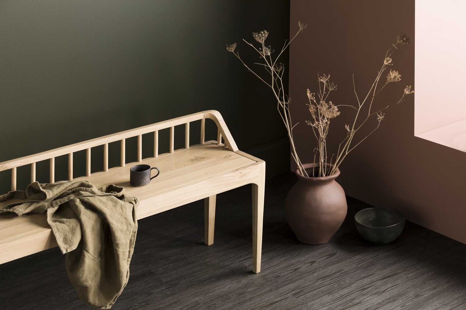
‘Free Flow’ is created with warm, organic tones and subtle textures.


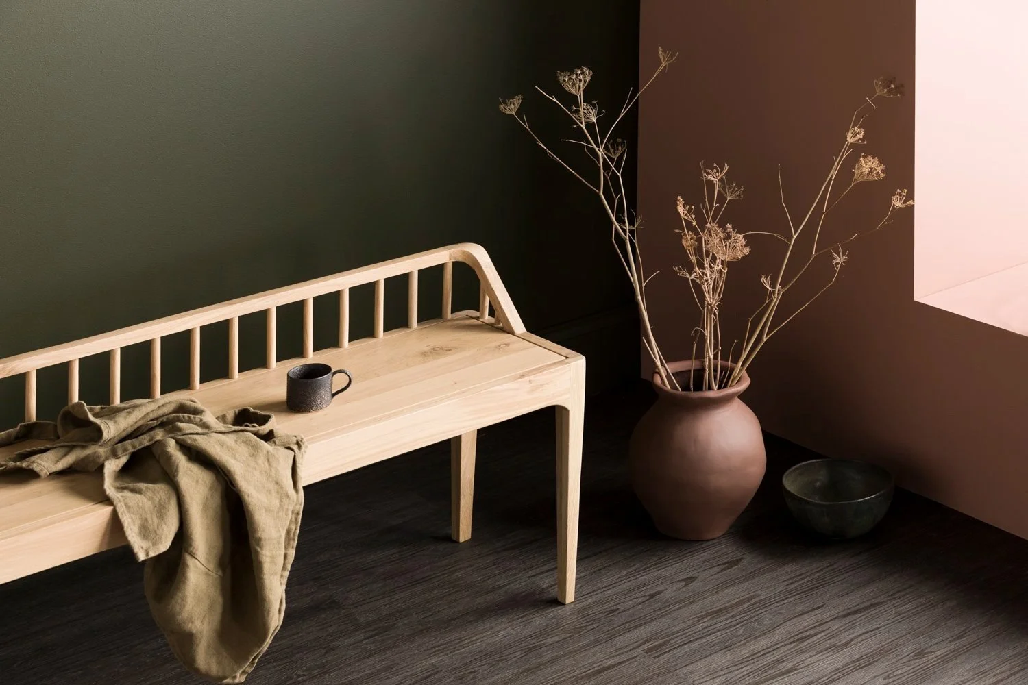
‘In Balance’ represents the deeper, moodier tones of traditional spaces.


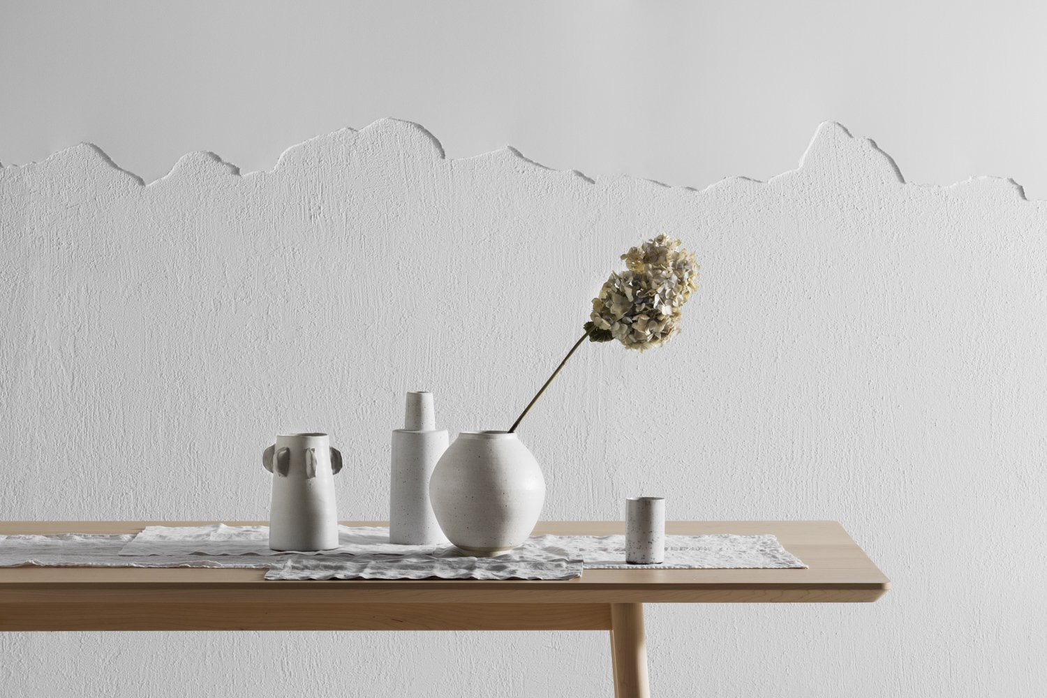
‘Deep Calm’ focuses on tonal shifts creating a layered minimalism.
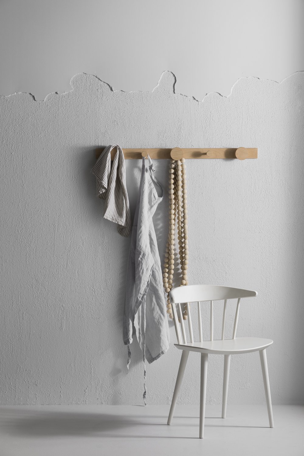

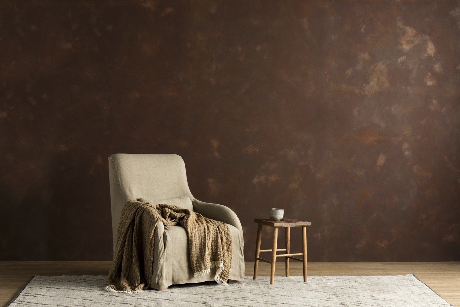
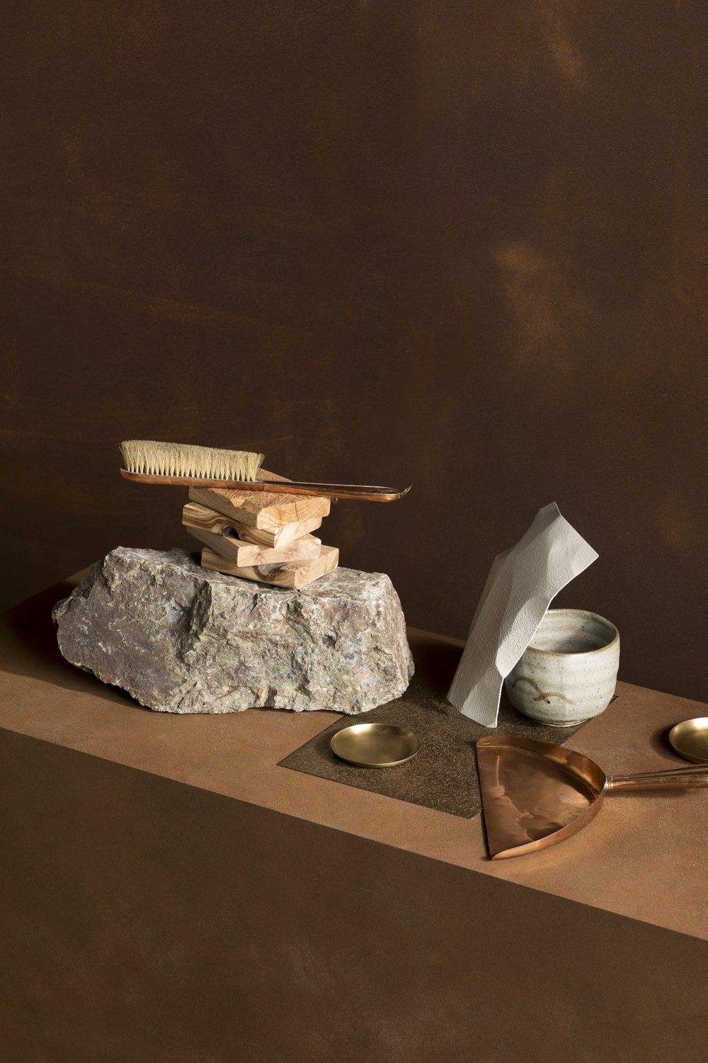
‘Slow Life’ a rustic feel with copper and rust shades.

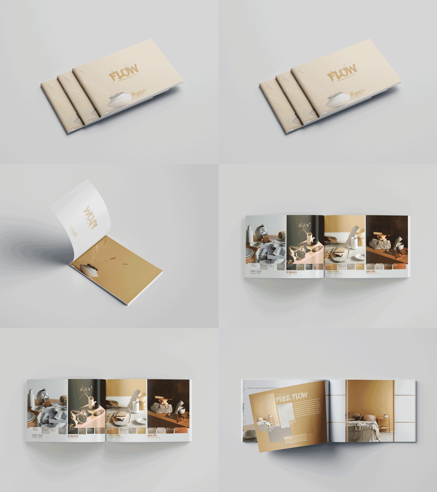
A5 Booklet distributed at events and via mail with product samples.


A4 Flyer
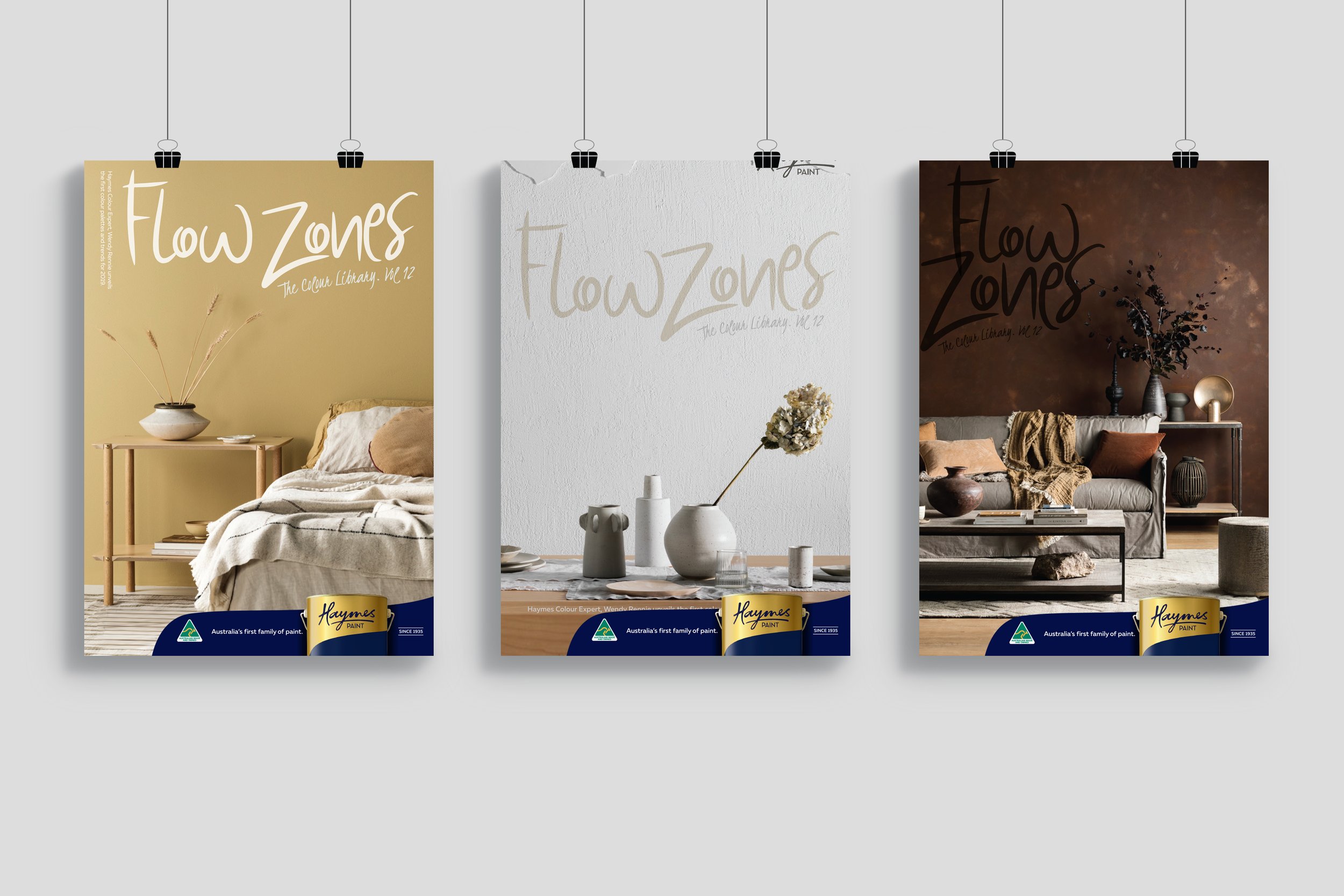
In store posters