Colour Planet
Concept Development
Brief
Create a visual foundation for Haymes Paint's Colour Planet colour system, one with longevity, that could evolve and be applied across future assets over time as the platform is rolled out and adapts.
Creative Solution
A literal planet or globe felt too obvious and clichéd, and the visual language needed to be clearly distinct from previous Haymes Blue fandeck designs. Very light colours, such as white, were also avoided, as they show dirt and age more quickly in a physical, handled product.
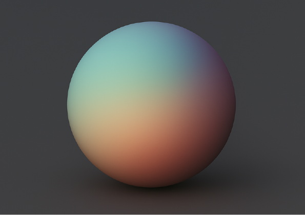
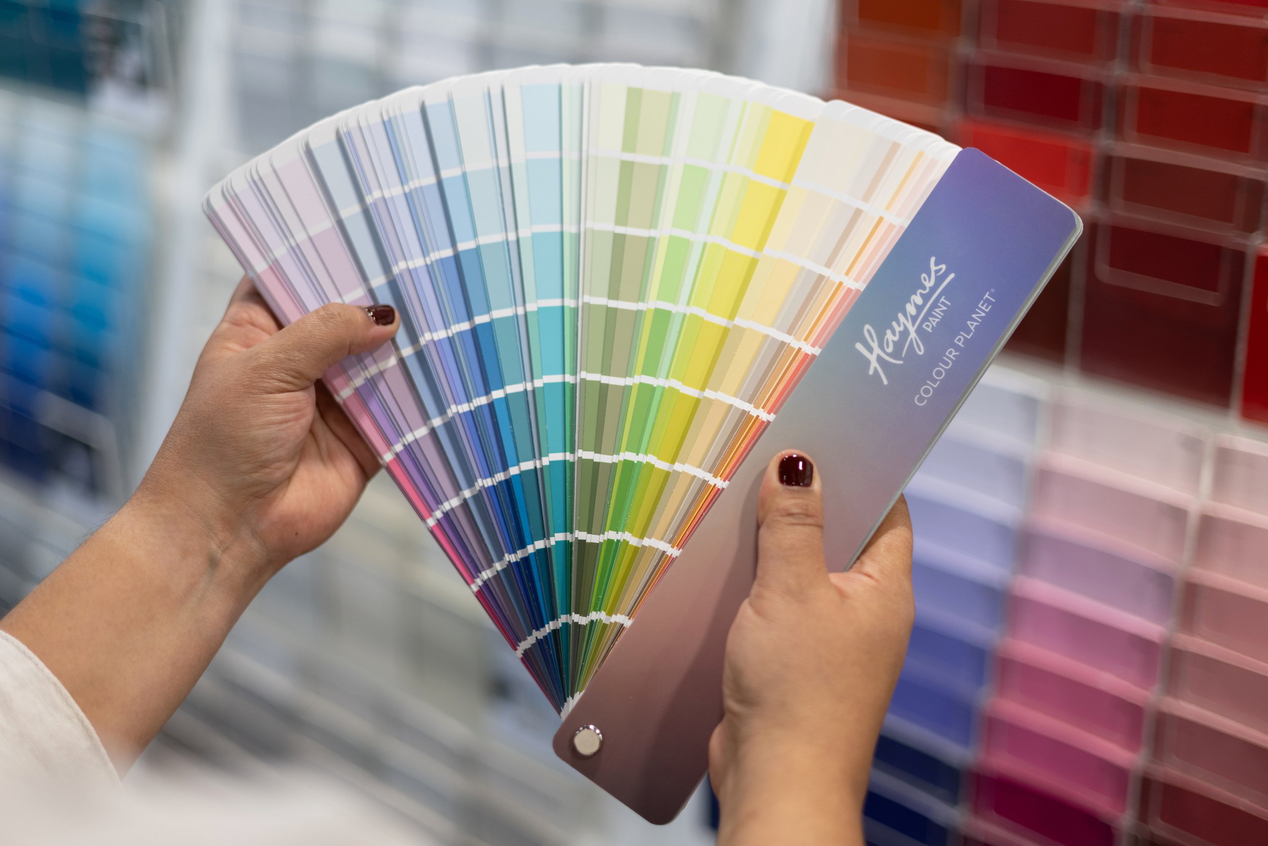
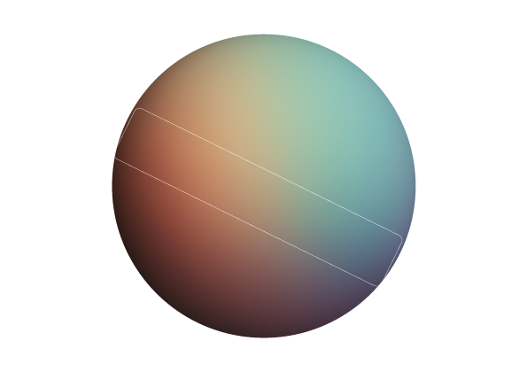
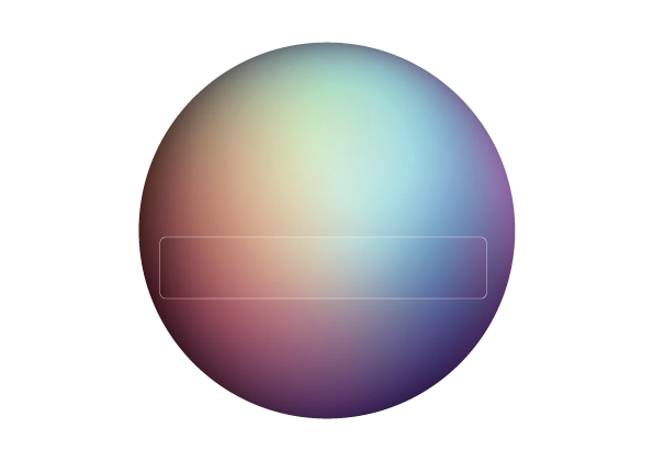
Using Midjourney, I generated a series of coloured spheres based on the Munsell colour system, representing the harmony of the Colour Planet system as light travelling across a surface, rather than a literal planet. I added and subtracted colour via the prompt, generating a series of spheres with different flows of colour. A closely cropped slice of one of these spheres became the primary visual device, and was applied to the first piece of tangible collateral, the fandeck cover. It was created to be flexible, reproducible across multiple colourways, and suitable as a background for further graphic treatments, without locking the brand into a single fixed visual approach for future assets.
These AI-generated foundations then formed the creative brief for an external agency, who further adapted the brand and rolled it out across all market collateral.