Colour Conscience
Concept Development
Art Direction
Design
Brief
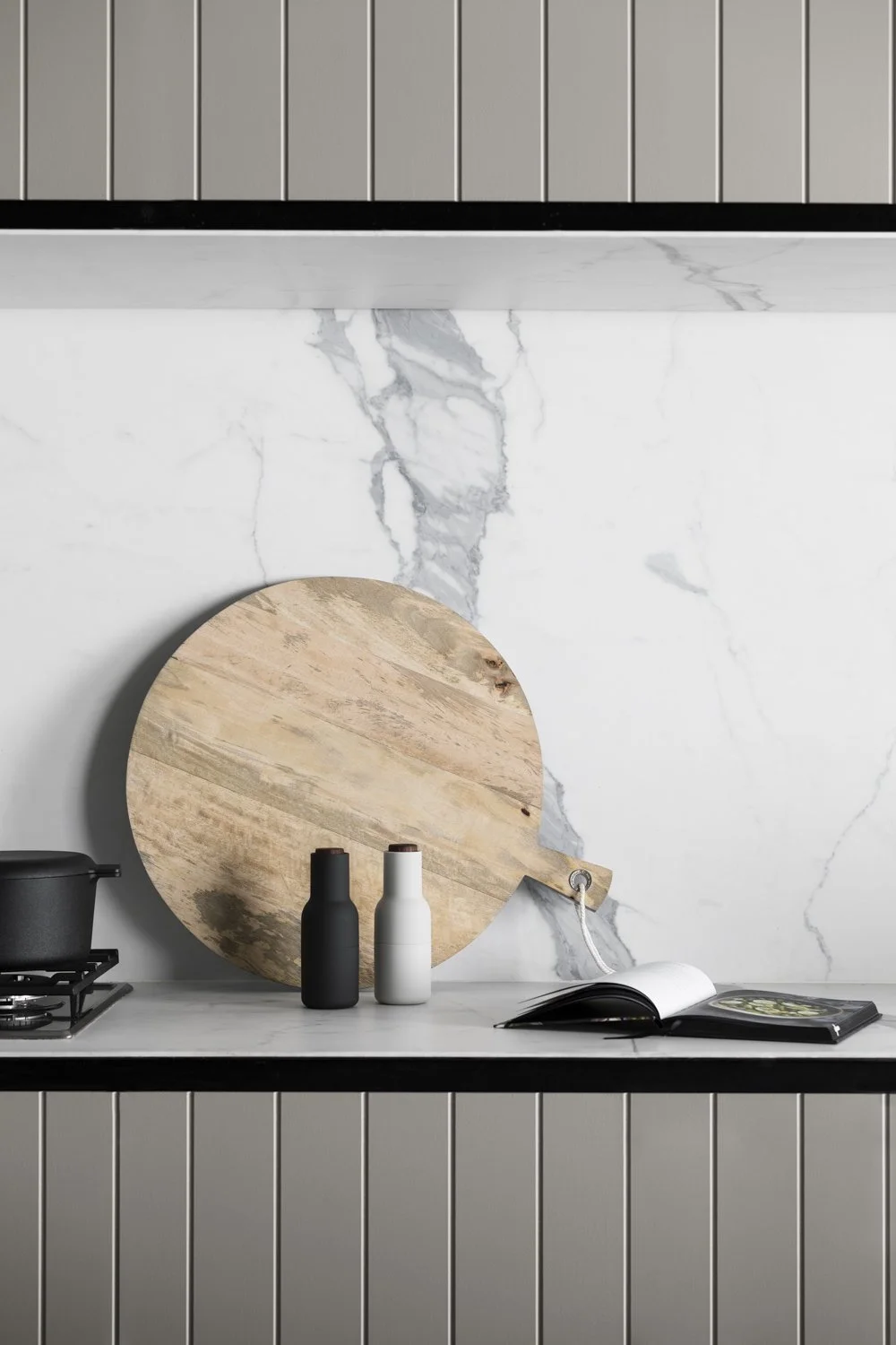
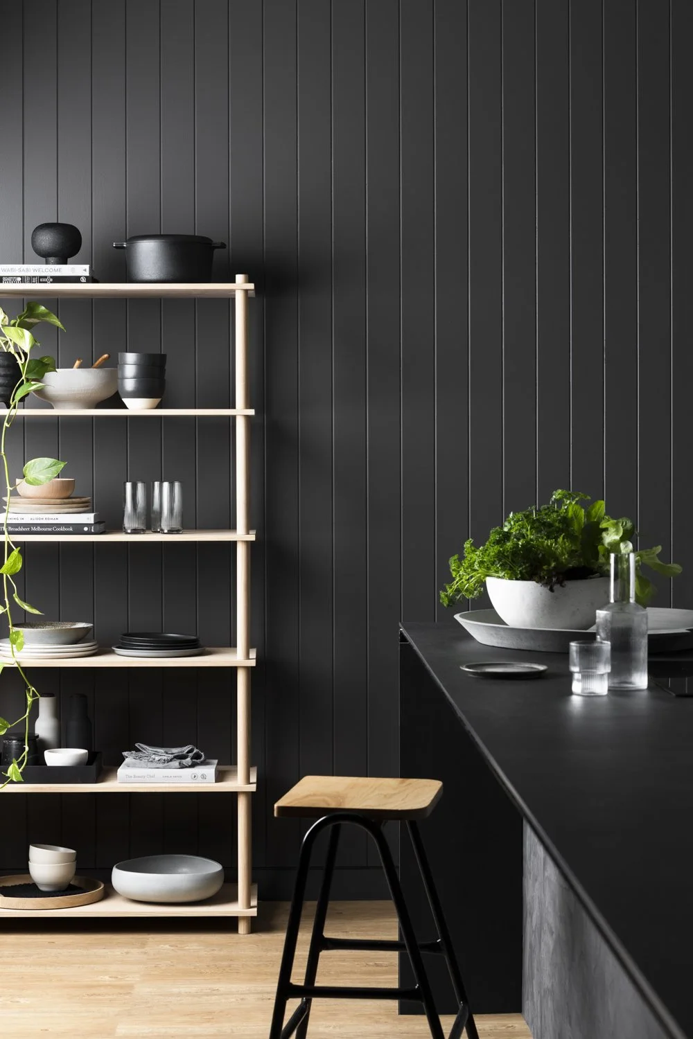
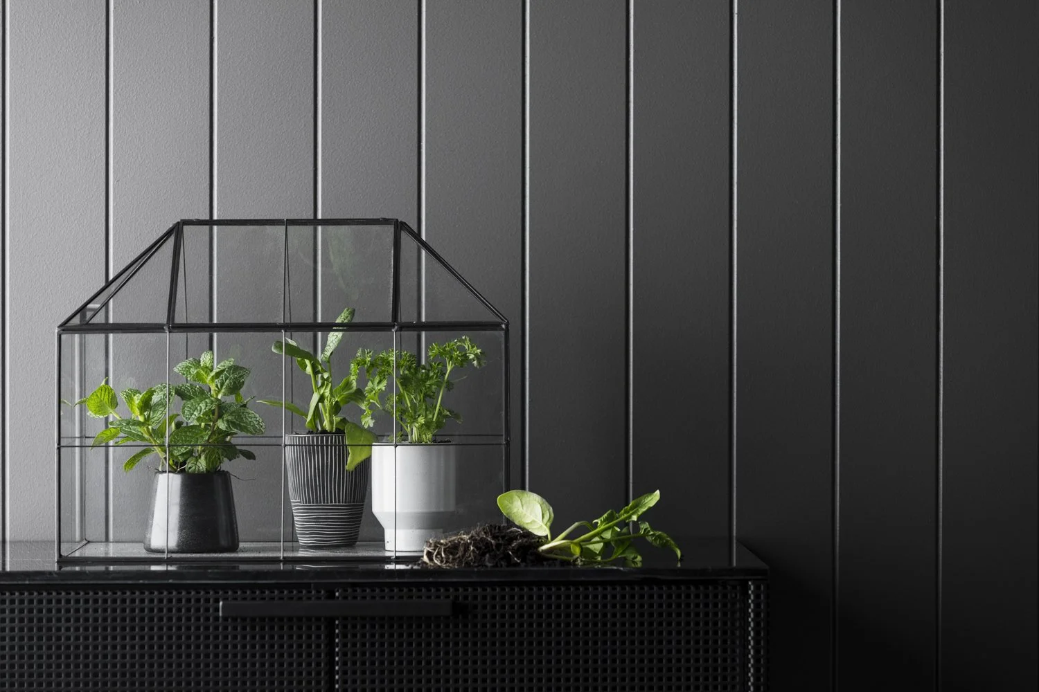
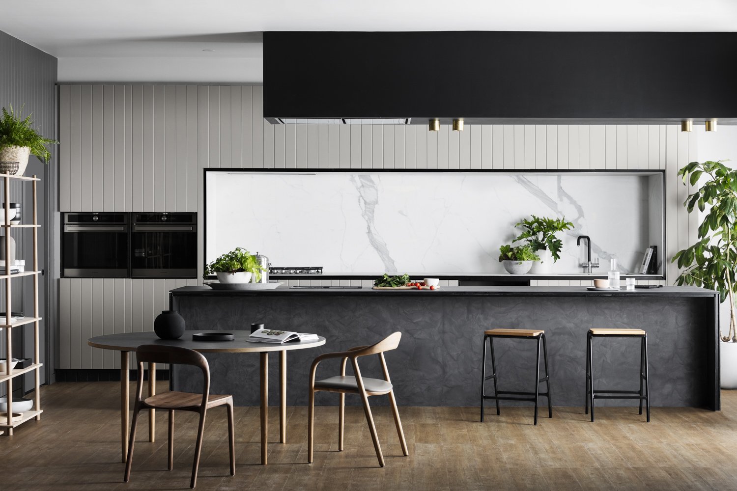
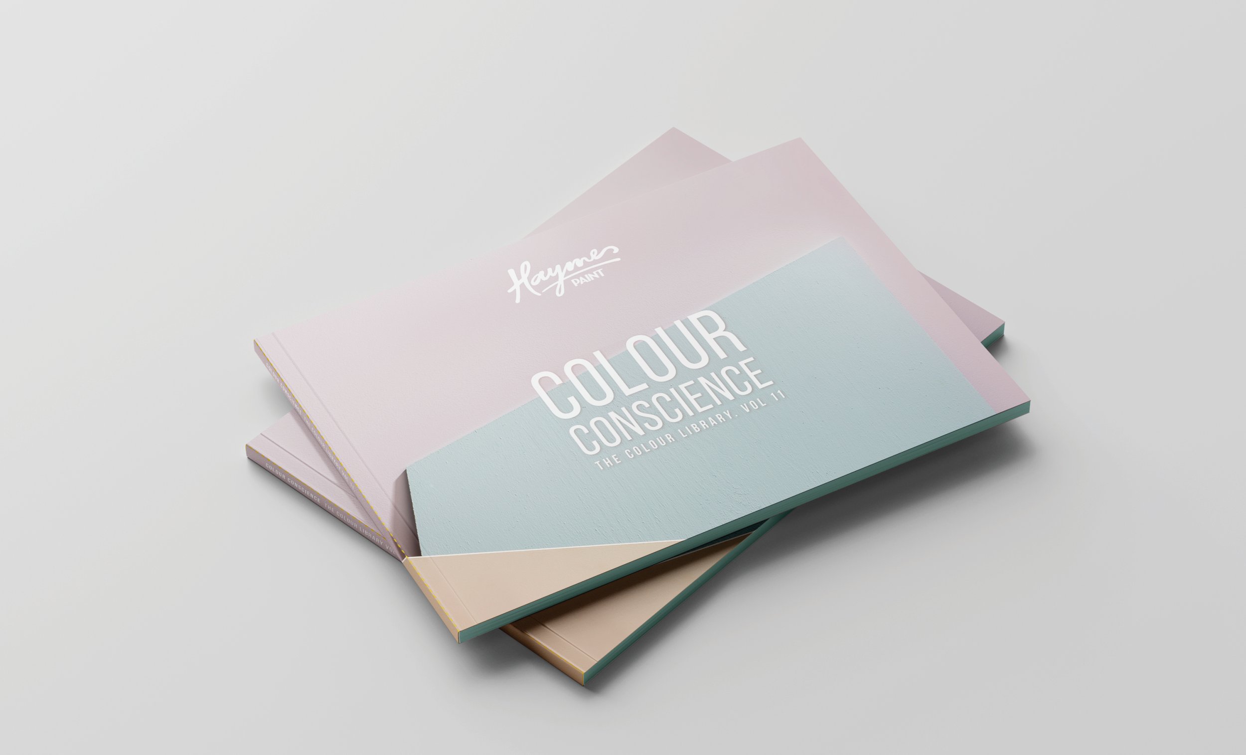
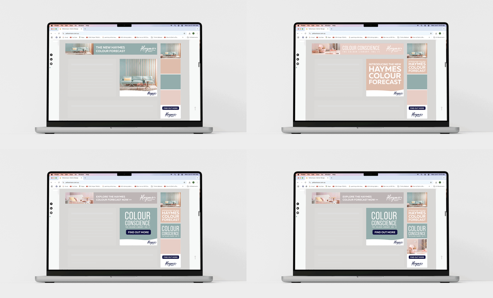
A campaign developed to representing three key wants in the homewares market .
Creative Solution
I worked with the Colour and Concept Manager to refine the three colour palettes, developed the creative direction for each theme, briefed set builds and styling direction, and wrote detailed briefs for the photographer and stylists.
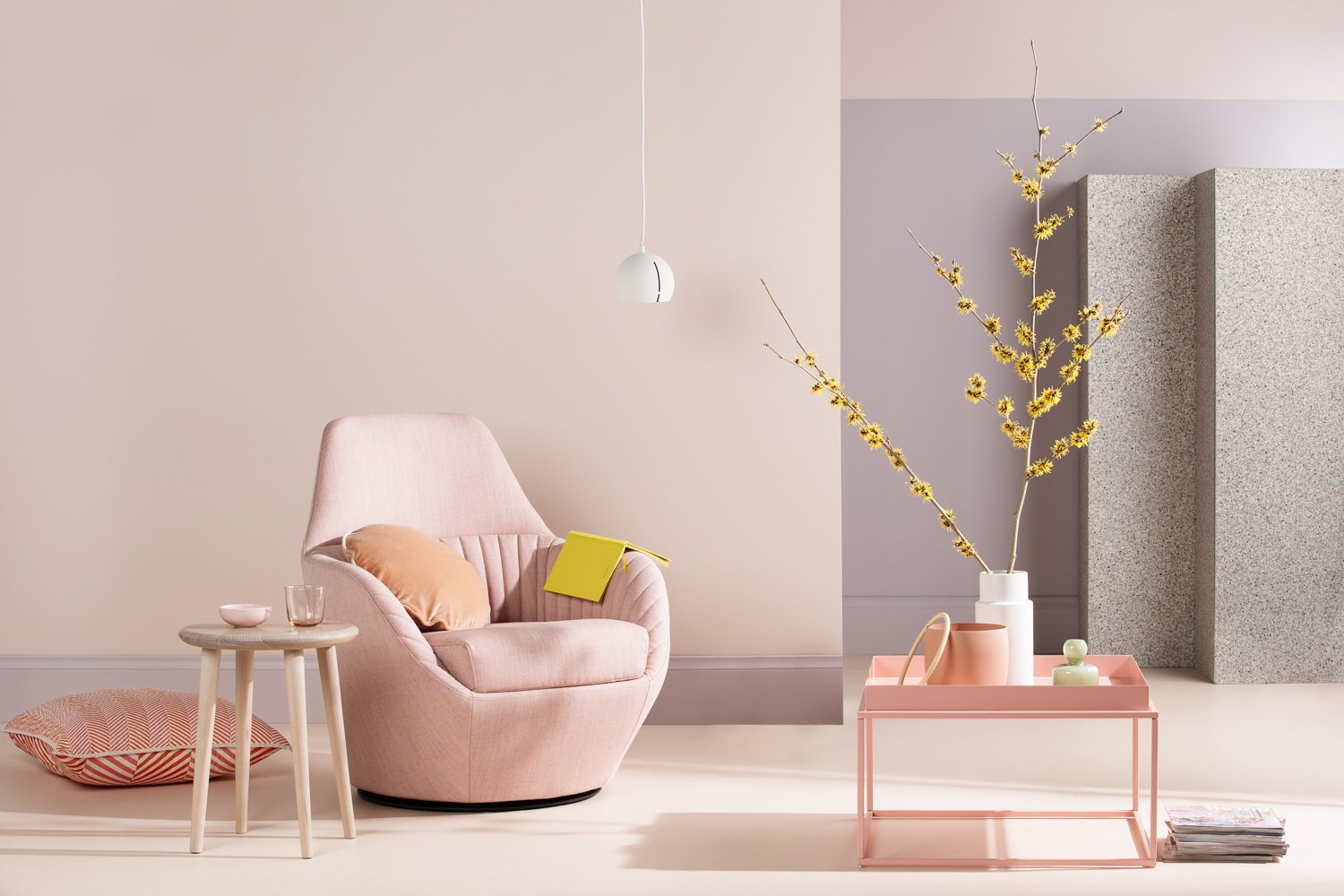
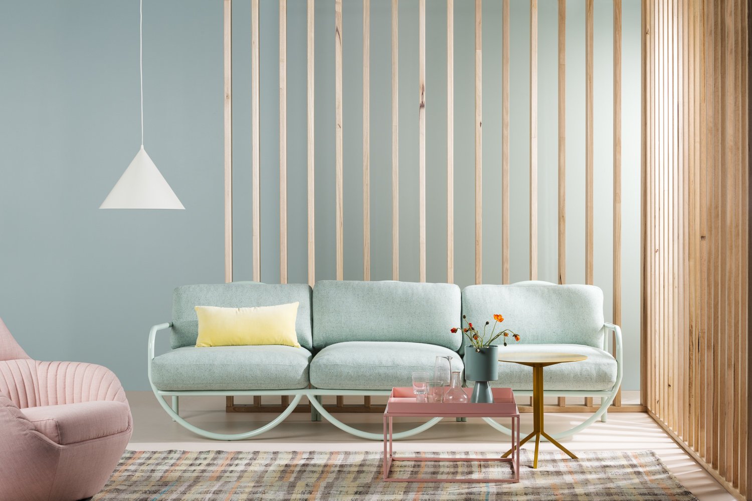
Cohabitate: Developed in response to the growing need for multifunctional spaces within the home. These areas may serve as places to entertain or spaces for quiet reflection.
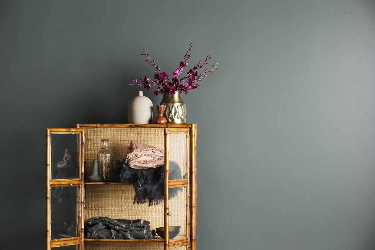
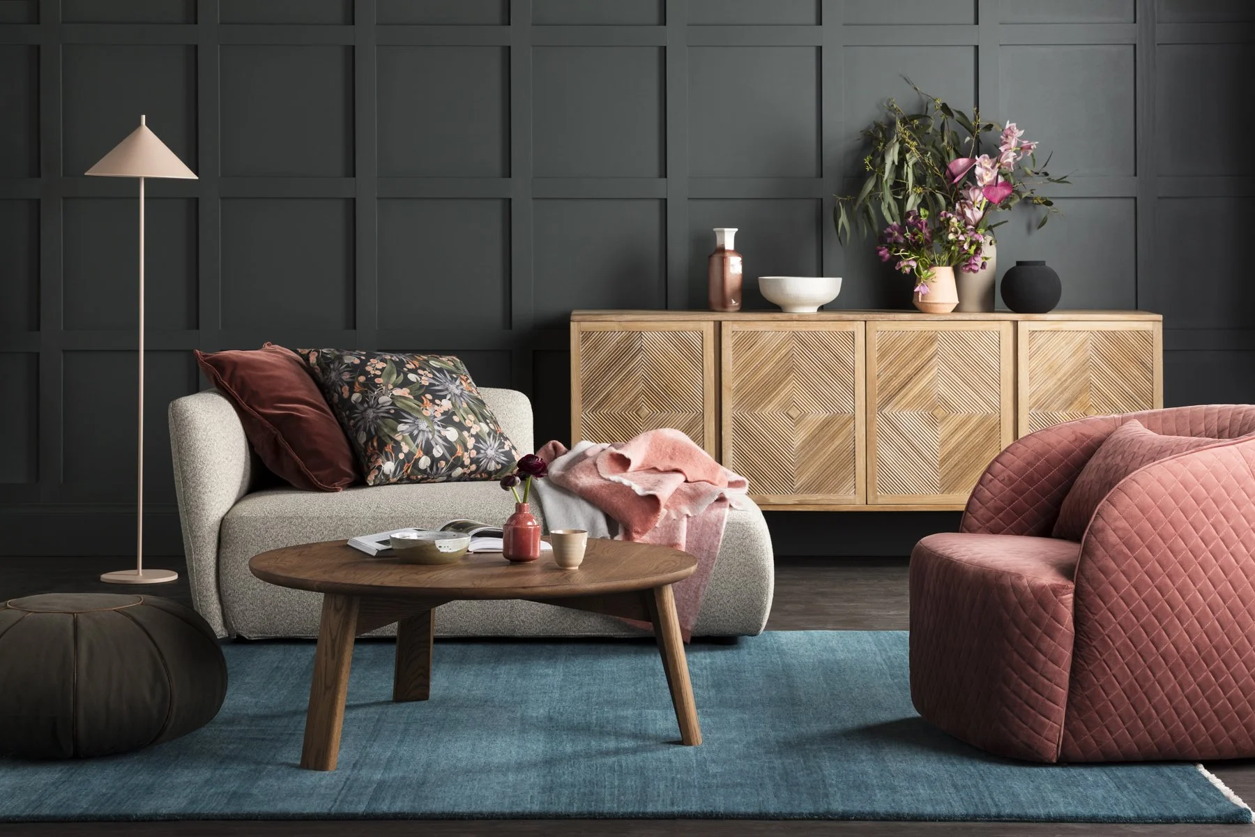
Comfort: Reflects the timeless need to surround ourselves with colours and objects that soothe and relax us.
Contribute: Speaks to the desire to make small, intentional decisions in our lives and homes that support a more sustainable, considered lifestyle.
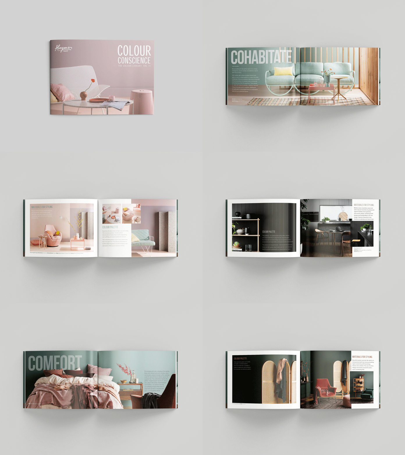

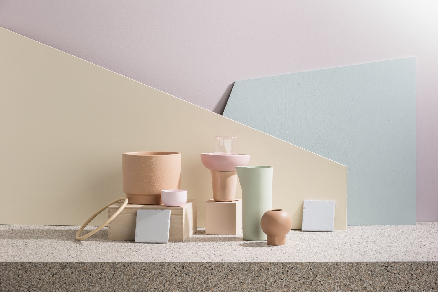
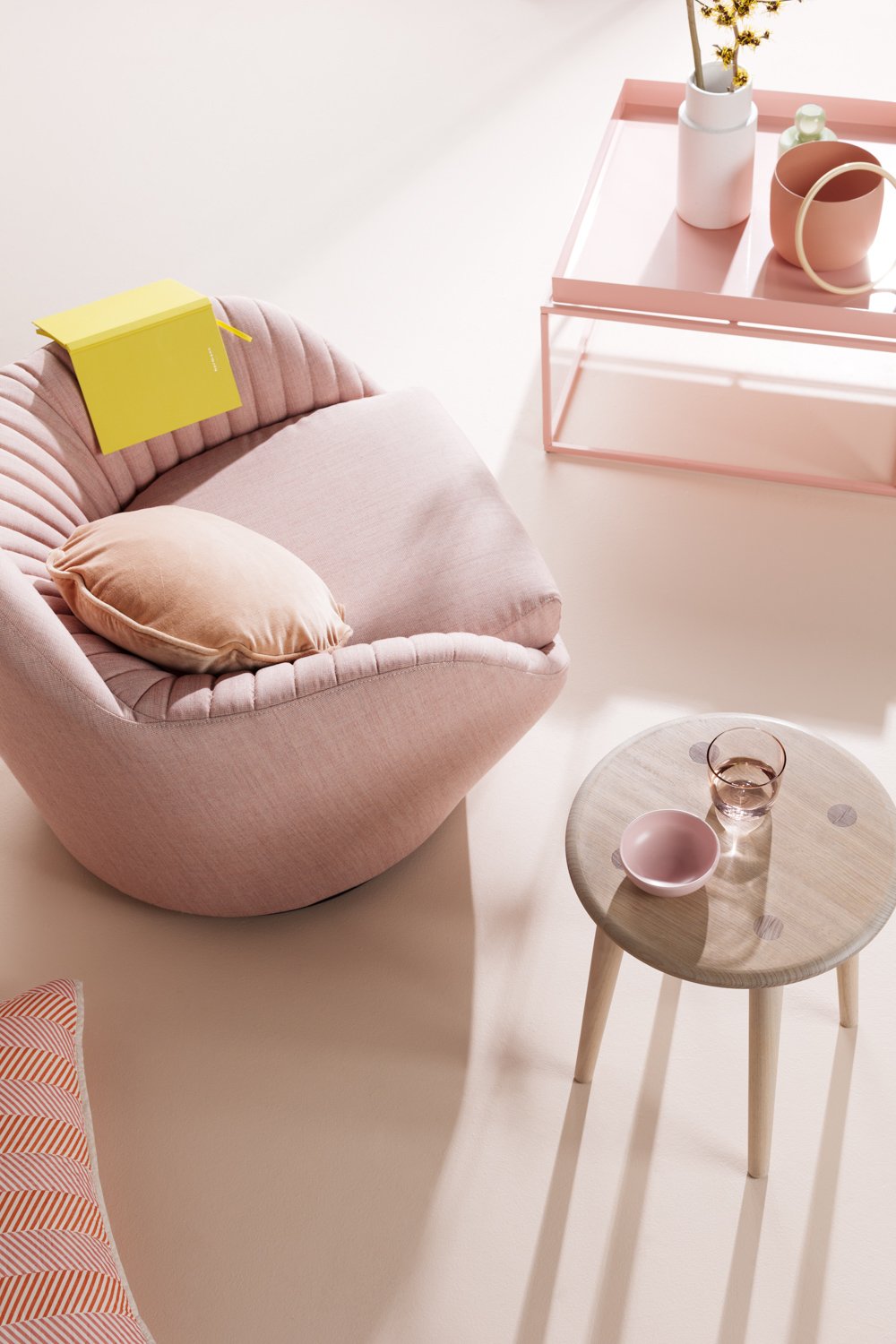
COHABITATE - Pastel colors were used to create a calm, welcoming, and warm imagery.


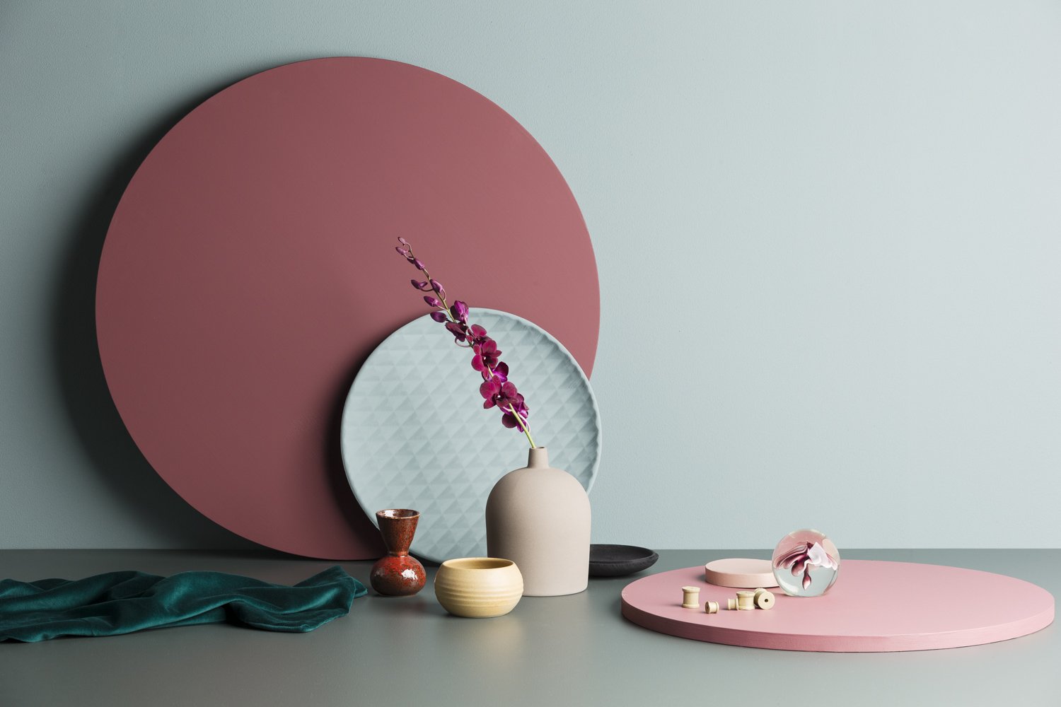
COMFORT - Dark green, is associated with comfort due to its calming and relaxing effects.

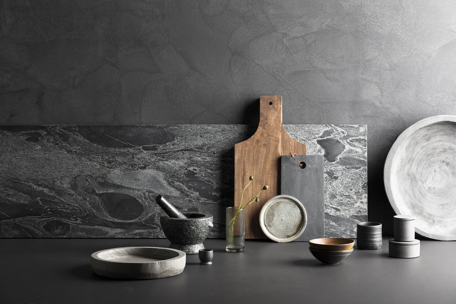
CONTRIBUTE - Created around the ethos of products that contribute to wellbeing, Dark and earthy, with shade of stone.